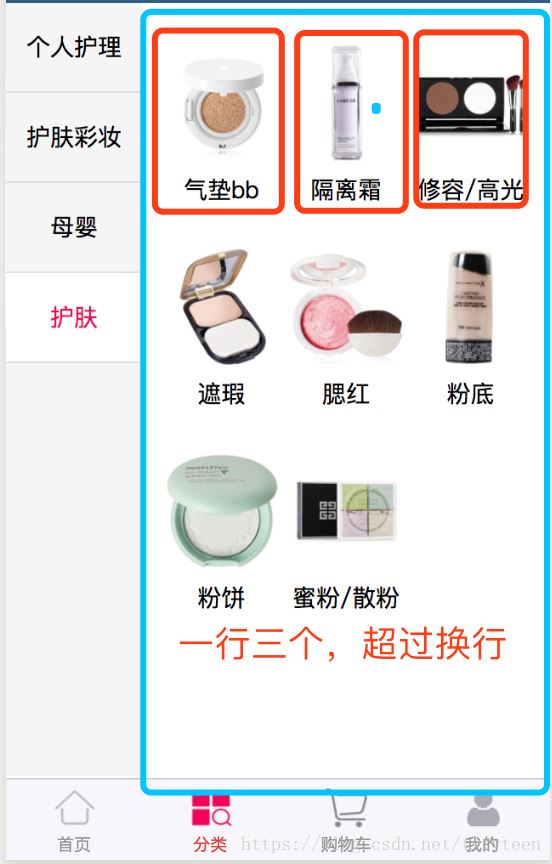
一、本文实现的效果图如下:布局右侧使用flex布局,超过3个则换行。
父元素代码如下:
.nav-right{
  width: 75%;
  padding: 10px;
  display: flex;
  /* 默认是水平的 */
  flex-direction: row;/*设置子元素的排列方向*/
  flex-wrap: wrap;/*溢出则换行*/
}
子元素代码如下:
.nav-right-item{
  width: 33.33%;
  height: 120px;
  text-align: center;
}
但是结果并不如人愿,行与行之间存在空白间隙

解决办法只需要在父元素加上align-content:flex-start
.nav-right{
  width: 75%;
  padding: 10px;
  display: flex;
  flex-direction: row;
  flex-wrap: wrap;
  align-content: flex-start/*子元素之间取消空白间隙,并把项目放在容器顶部。*/
}
align-content
作用:
会设置自由盒内部各个项目在垂直方向排列方式。
条件:
必须对父元素设置自由盒属性display:flex;,并且设置排列方式为横向排列flex-direction:row;并且设置换行,flex-wrap:wrap;这样这个属性的设置才会起作用。
设置对象:
这个属性是对她容器内部的项目起作用,对父元素进行设置。
取值:
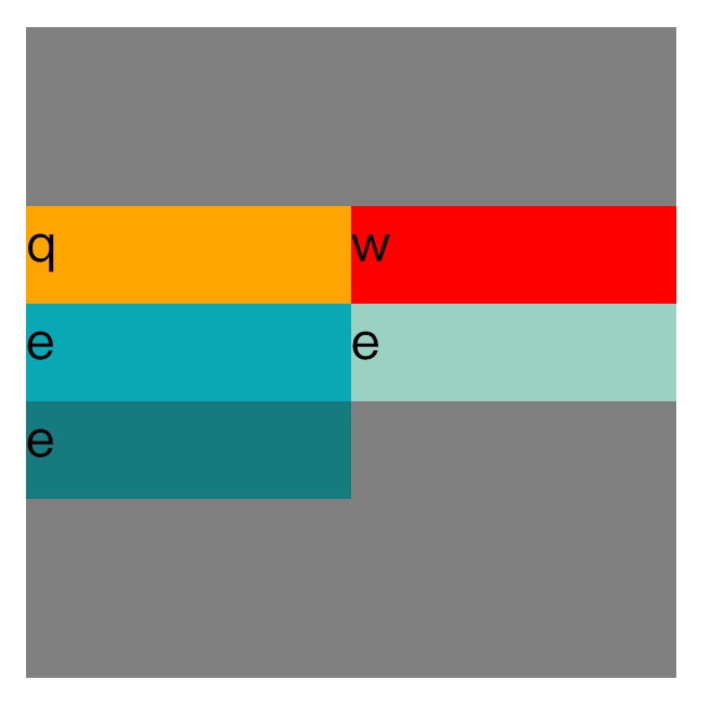
stretch:默认设置,会拉伸容器内每个项目占用的空间,填充方式为给每个项目下方增加空白。第一个项目默认从容器顶端开始排列。

<!DOCTYPE=html>
<html lang="zh-cn">
<head>
<meta charset="UTF-8">
<title>
Align-content
</title>
<style>

#father{

    width:200px;
    display:flex;
    flex-direction:row;
    flex-wrap:wrap;
    align-content:strech;
    height:200px;
    background-color:grey;
}
.son1{

    height:30px;
    width:100px;
    background-color:orange;
}

.son2{

    height:30px;
    width:100px;
    background-color:red;
}

.son3{

    height:30px;
    width:100px;
    background-color:#08a9b5;
}


</style>
</head>
<body>
<div id="father">
    <div class="son1">q</div>
    <div class="son2">w</div>
    <div class="son3">e</div>
    <div class="son3">e</div>
    <div class="son3">e</div>
</div>
</body>
</html>
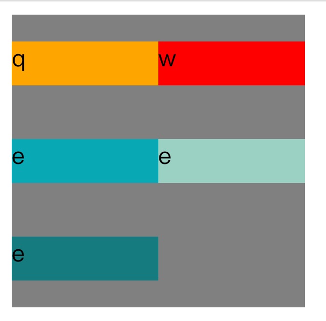
Center:这个会取消项目之间的空白并把所有项目垂直居中。
<!DOCTYPE=html>
<html lang="zh-cn">
<head>
<meta charset="UTF-8">
<title>
关于文档元素测试
</title>
<style>

#father{

    width:200px;
    display:flex;
    flex-direction:row;
    flex-wrap:wrap;
    align-content:center;
    height:200px;
    background-color:grey;
}
.son1{

    height:30px;
    width:100px;
    background-color:orange;
}

.son2{

    height:30px;
    width:100px;
    background-color:red;
}

.son3{
    height:30px;
    width:100px;
    background-color:#08a9b5;
}


.son4{
    height:30px;
    width:100px;
    background-color:#9ad1c3;
}

.son5{

    height:30px;
    width:100px;
    background-color:rgb(21,123,126);
}
</style>
</head>
<body>

<div id="father">
    <div class="son1">q</div>
    <div class="son2">w</div>
    <div class="son3">e</div>
    <div class="son4">e</div>
    <div class="son5">e</div>
</div>

</body>
</html>
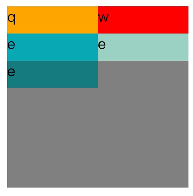
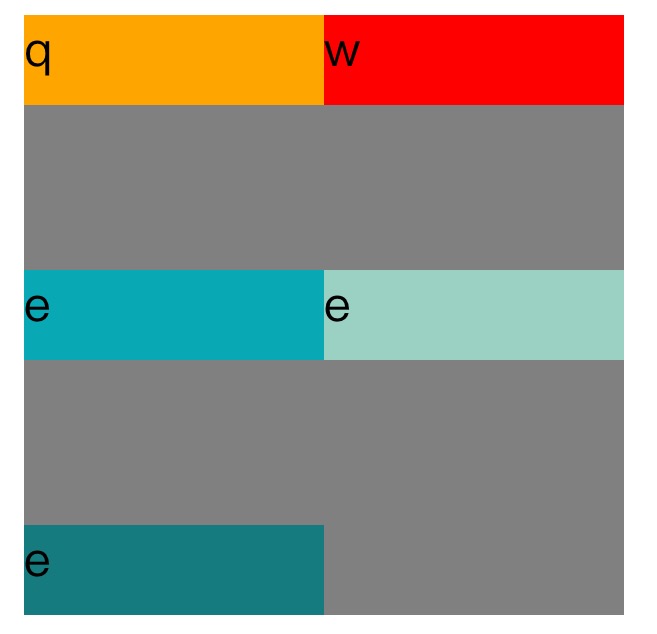
flex-start:这个会取消项目之间的空白,并把项目放在容器顶部。
<!DOCTYPE=html>
<html lang="zh-cn">
<head>
<meta charset="UTF-8">
<title>
关于文档元素测试
</title>
<style>

#father{

    width:200px;
    display:flex;
    flex-direction:row;
    flex-wrap:wrap;
    align-content:flex-start;
    height:200px;
    background-color:grey;
}
.son1{

    height:30px;
    width:100px;
    background-color:orange;
}

.son2{

    height:30px;
    width:100px;
    background-color:red;
}

.son3{

    height:30px;
    width:100px;
    background-color:#08a9b5;
}


.son4{

    height:30px;
    width:100px;
    background-color:#9ad1c3;
}

.son5{

    height:30px;
    width:100px;
    background-color:rgb(21,123,126);
}
</style>
</head>
<body>

<div id="father">
    <div class="son1">q</div>
    <div class="son2">w</div>
    <div class="son3">e</div>
    <div class="son4">e</div>
    <div class="son5">e</div>
</div>

</body>
</html>
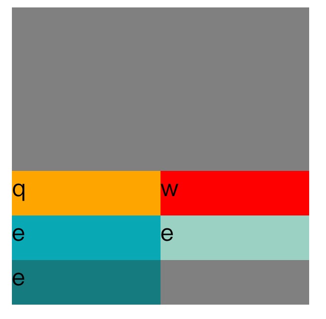
flex-end:这个会取消项目之间的空白并把项目放在容器底部。
align-content:flex-end;
space-between这个会使项目在垂直方向两端对齐。即上面的项目对齐容器顶部,最下面一个项目对齐容器底部。留相同间隔在每个项目之间。
align-content:space-between;
space-around:这个会使每个项目上下位置保留相同长度空白,使得项目之间的空白为两倍的单个项目空白。
align-content:space-around;
inherit:使得元素的这个属性继承自它的父元素。
innitial:使元素这个属性为默认初始值。
注:文章部分代码来自关于css中的align-content属性详解
到此这篇关于flex布局换行空白间隙之align-content的使用的文章就介绍到这了,更多相关flex换行空白间隙内容请搜索脚本之家以前的文章或继续浏览下面的相关文章,希望大家以后多多支持脚本之家!
 相关文章
相关文章

 精彩导读
精彩导读
 热门资讯
热门资讯